The Year To Date... Sort Of
I just wanted to share the typical snapshots of the horserace as they exist so far. I find these graphs less useful than the pace graphs for a few reasons:
- They show week to week standing changes well, but always in relation to the other teams, not in terms of thinking for a whole season.
- The pace charts nicely isolate one team's performance against an expected result. These do not.
- The pace graphs show the effect of having a game in hand better. Here, FC Dallas is at the top of the chart, but that might change depending on the results of this weekend's games.
Anyways, here we go, starting with the Suppoter's shield. This will look similar to the Pace graph posted yesterday since the top team in MLS happens to be exactly on shield pace at the moment.
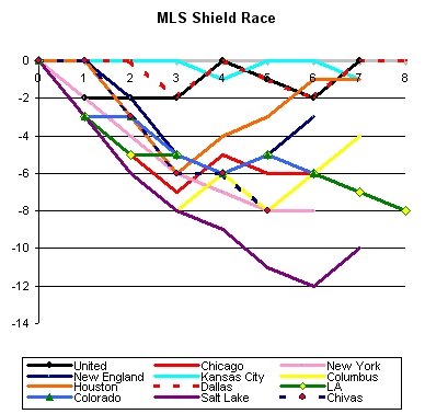
Mildly interesting facts? New England and Columbus have put together some nice moves in recent weeks, the Houston Dip at the start of the season is very noticable, and LA, when we look back at the regular season, may find that both Chivas and RSL were doing better by their eighth game than LA. Huh.
Here are the divisional races:
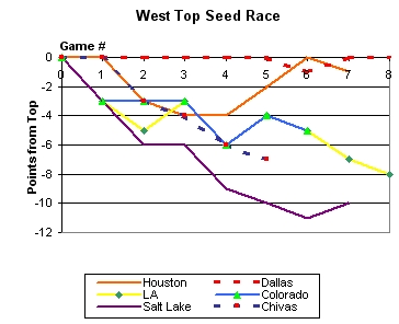
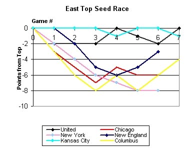
Make of it what you will.
posted by D @ 3:20 PM
![]()
![]()

0 Comments:
Post a Comment
<< Return to The DCenters Main Page (HOME)